
AI Visuals and Brand Imagery often focus on speed, energy, and attention. Bright mornings. Fast routines. Loud visuals. But coffee doesn’t only belong to the start of the day. For many people, the most meaningful relationship with coffee happens late at night, when distractions fade and decisions become intentional.
VÉRNOIR was created as a hypothetical premium coffee brand to explore that overlooked moment. This case study shows how AI was used to design a calm, night-first visual identity built around focus, restraint, and human psychology, not caffeine claims.
Most coffee brands are designed for mornings.
Bright light, fast motion, loud energy.
But coffee is just as present at night. Sometimes more.
Late at night, coffee isn’t about speed. It’s about focus, calm, and staying present when everything else slows down. This case study explores how we used AI-generated visuals to design a premium coffee brand around that overlooked moment.
The brand is called VÉRNOIR.
The idea is simple: Coffee in the Dark.
This project demonstrates how AI visuals and brand imagery can be used to create emotional, premium brand storytelling when guided by psychology instead of trends.
The Idea Behind VÉRNOIR
VÉRNOIR is a hypothetical premium coffee brand created as a visual and branding experiment. Instead of asking “How do we sell coffee?”, the project started with a different question:
What does coffee mean at night?
At night:
- People are more aware
- Distractions are lower
- Choices are intentional
That mindset shaped every visual decision in this project. The visual approach was inspired by principles of consumer psychology and emotional branding, where mood and context influence perception more than product features. We use the same consumer psychology and emotional branding our AI visuals and brand imagery case study to build our hypothetical premium coffee brand!
From Reference to Identity: Building the Visual Language | AI Visuals and Brand Imagery
The visual direction started from a single high-end coffee reference image. Not to copy it, but to understand what works at a psychological level. We noticed three things:
- Premium coffee visuals rely on restraint, not chaos
- Dark environments make the product feel intentional
- Human presence changes how the product is perceived
From there, a clear visual system emerged:
- Matte black as the dominant surface
- Gold typography for authority
- Deep ceramic red for warmth and contrast
- Steam, foam, and condensation treated realistically
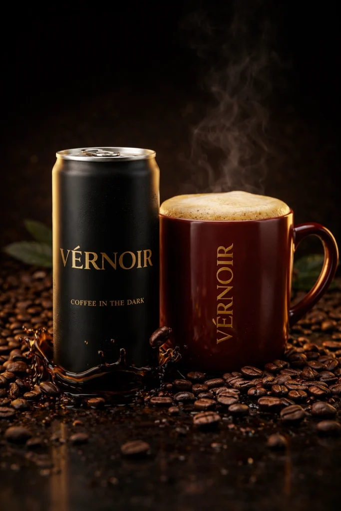
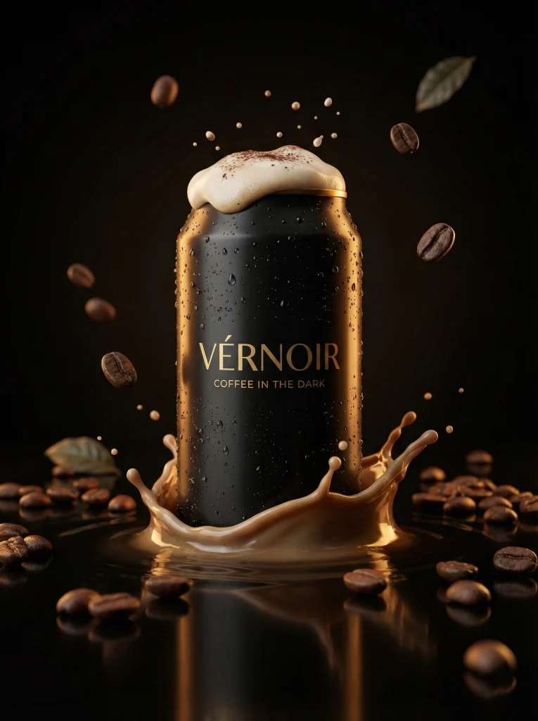
Creating the Product Visuals (Without Overdoing It)
The first phase focused purely on the product. The goal was to make the coffee can and mug feel real, premium, and grounded. No exaggerated splashes. No unrealistic motion. Everything needed to feel physically believable.
Generic Prompt Structure – Product Shot (Simplified): A premium cinematic coffee product shot set at night. Dark background, warm highlights, realistic materials. The product is the focus, with subtle coffee beans, controlled liquid interaction, and natural textures. The mood is calm, confident, and refined.
This structure allowed the visuals to stay consistent across multiple generations without losing realism.
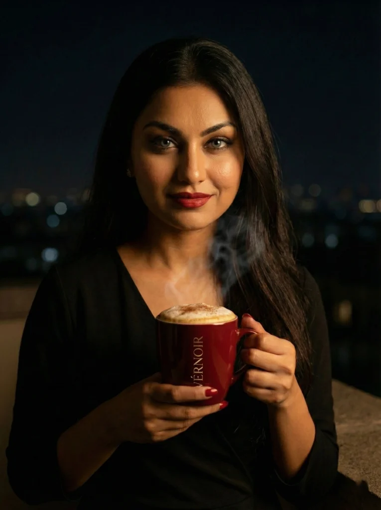
Adding the Human Element: Making the Brand Feel Lived-In
Once the product identity was clear, the next step was introducing a human presence. But this wasn’t about influencer marketing. The intention was to show how the brand fits into real late-night moments. That meant:
- No café settings
- No morning light
- No exaggerated expressions
The human visuals were designed to feel like quiet pauses: holding a mug, standing with a can, or simply being present at night.
Generic Prompt Structure – Human + Product (Simplified) : A cinematic night-time lifestyle portrait. The subject is calm, composed, and grounded. The product supports the moment rather than dominating it. Lighting is low-key, textures are realistic, and the mood reflects focus and stillness.
This approach helped the visuals feel editorial rather than promotional.
Why This Approach Works and What This Case Study Demonstrates
People don’t connect with products first. They connect with moments. By designing the visuals around late-night psychology, the brand feels more personal and believable. The coffee becomes part of a ritual, not just an object. That’s where AI becomes powerful, not as a shortcut, but as a tool for controlled creative exploration. This project shows how AI can be used to:
- Build a consistent visual identity
- Translate abstract brand ideas into imagery
- Create premium-looking assets without volume-based generation
- Support storytelling instead of replacing it
VÉRNOIR is hypothetical, but the process is very real.
Final Thought and Frequently Asked Questions!
Good branding doesn’t shout. It stays with you. VÉRNOIR was designed to show how AI visuals can feel calm, human, and intentional when driven by psychology instead of trends.
What is AI Visual Branding?
AI visual branding is the use of AI image-generation tools to create consistent, brand-aligned visual assets. When guided properly, AI can support professional-grade branding rather than generic imagery.
Can AI-generated images look premium?
Yes. Premium results depend more on visual direction and restraint than on the tool itself. Clear intent and controlled prompts matter more than complexity.
Is this a real coffee brand?
No. VÉRNOIR is a hypothetical brand created as a case study to explore AI visuals, brand imagery, and storytelling.
How were the visuals created?
The visuals were created using AI image models guided by structured prompts, reference images, and strict visual rules around lighting, color, and mood.
Can this approach be used for real brands?
Absolutely. The same process can be applied to real products, campaigns, and portfolios where visual consistency and brand tone matter.
If You liked this Post, Then Do Read One where I focused on AI Photography Camera Angles: A Practical Guide for Cinematic AI Images